Chameleon Creative Group (Chameleon) is a company that specializes in promotional products, marketing, and design. They partner with non-profits, small businesses, and technology companies to help effectively communicate and build trust with constituents.
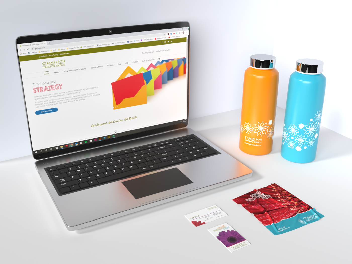
Above, from L to R: Chameleon Creative Group website with animated slider, business cards front (top) and back (bottom), microfiber cleaning cloth with image that highlights the printing capability, and water bottles with Chameleon's one color logo and flower highlighting size of imprint area.
When setting out to create a more flexible brand presence for Chameleon, several things became clear.
1. The flower, while not generally associated with Chameleons, has been a part of Chameleon Creative Group's branding. As such, it was a requirement to keep this as a consistent part of the brand.
2. The brand should be approachable and energetic.
3. The brand will need to be flexible to showcase promotional products and their advantages. As a promotional products distributor, Chameleon would often give Chameleon branded products to clients and potential clients for inspiration. As such, these items needed to have the Chameleon brand incorporate in such a way as to highlight specific, actionable attributes.
4. With experience, Chameleon's core audience responded most positively with bright, vibrant colors both on a sizable (trade show) and small scale (business cards). The vibrant colors also helped Chameleon stand out against competitors and shape Chameleon's visual presence.

Left: Branding colors for Chameleon.
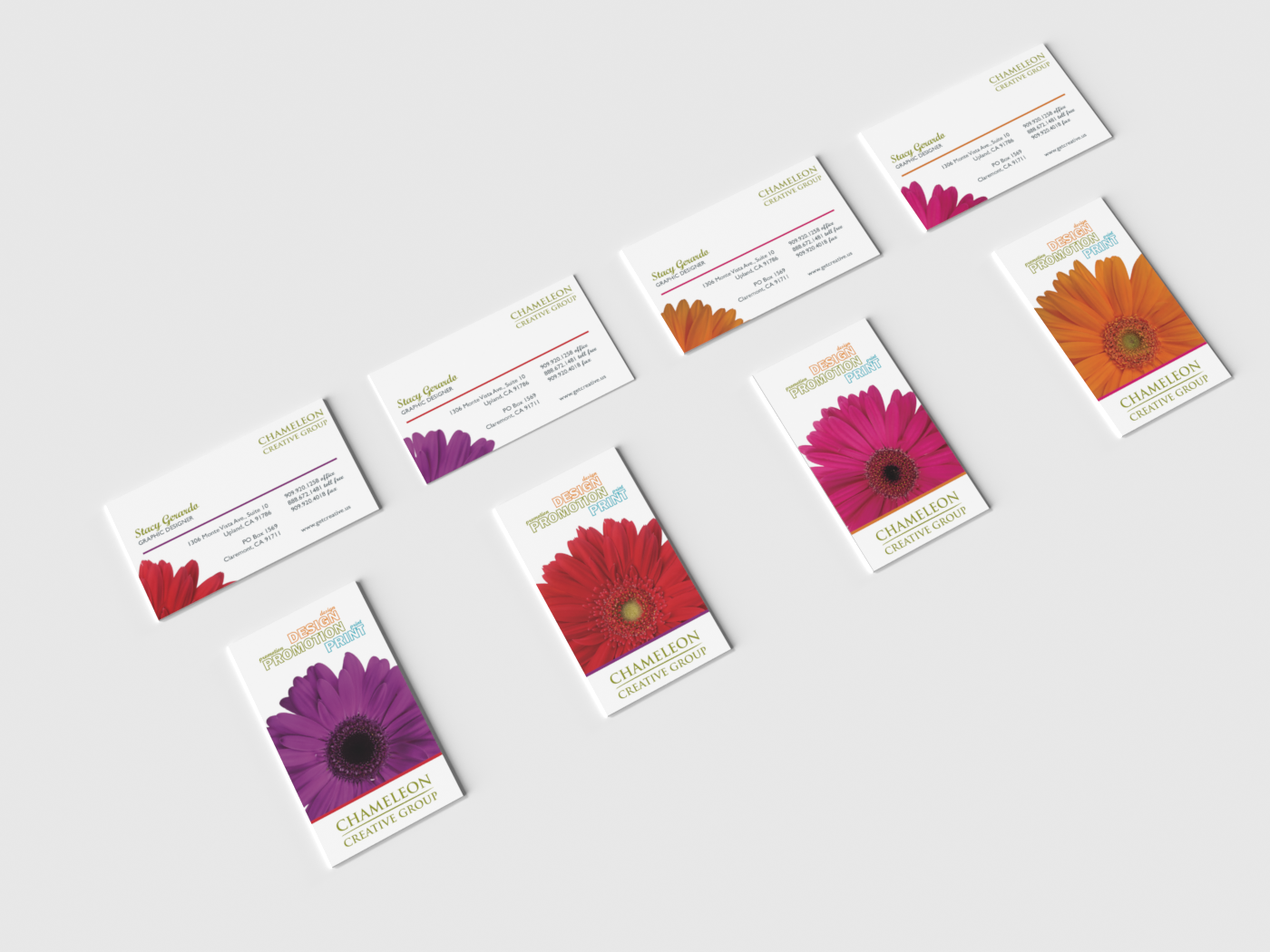
Right: Chameleon's business cards with variable data printing. This is a set for one person, however, several sets (for several employees) could be printed from one file.
Right: Chameleon's business cards with variable data printing. This is a set for one person, however, several sets (for several employees) could be printed from one file.
When it came time to redesign Chameleon Creative Group's business cards, the focus was to have a business card created that highlights Chameleon's ability to print with variable data. While variable data had been around, variable data that included variable imagery was relatively new. As shown above, flowers and horizontal lines change on the front and the back of each card. To keep visual continuity, the line color on the front of each card matches the flower on the back and vice versa.
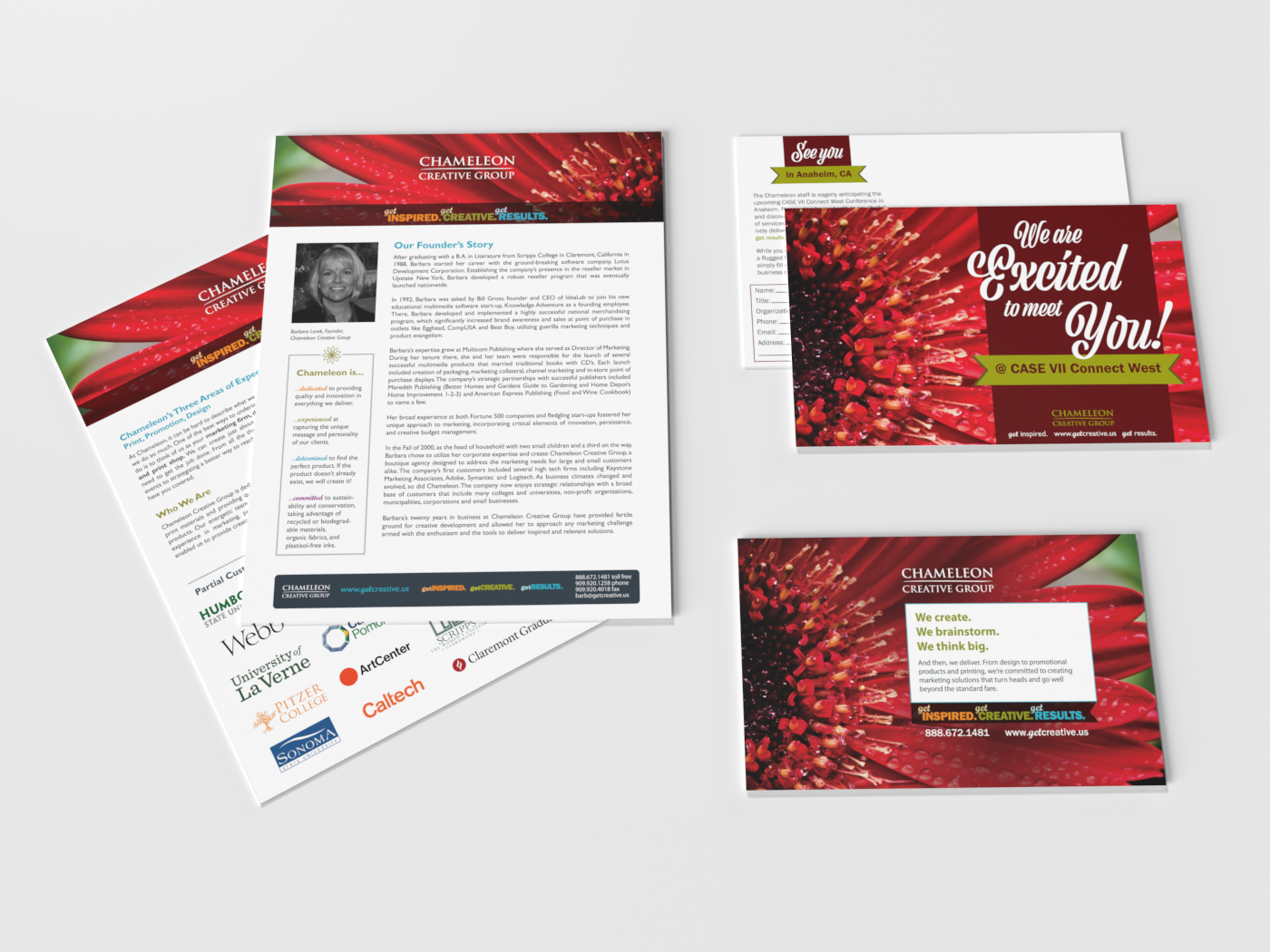
Above, L to R: Company overview and sample client list, special invitation to meet at conference booth (right top),
advertisement in conference program (right bottom).
advertisement in conference program (right bottom).
The red flower image is brought to the forefront to create continuity for event collateral and not compete with other elements. The bright red played well with Chameleon's primary and secondary color pallets.
Bright colors and detailed images of flowers were, once again, used to showcase printing quality on flyers, event invitation, and special event ad while keeping consistent with the flower centered brand.
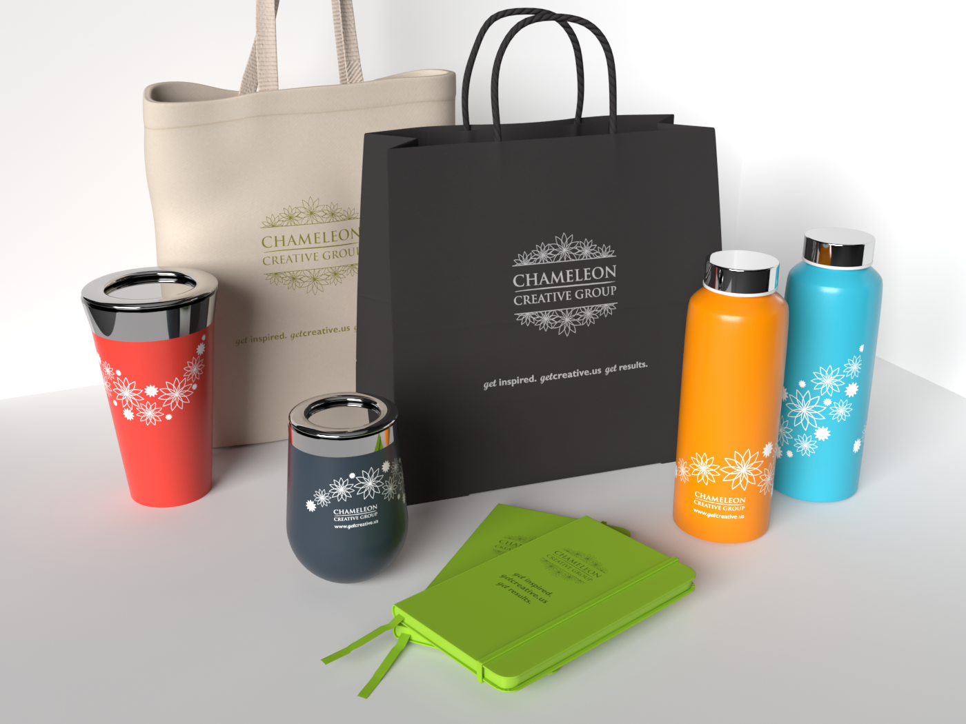
Above, L to R: Red tumbler, natural tote bag with artwork in Chameleon's green, grey stainless steel stemless wine tumbler, black tote with artwork in silver foil, green journals with deboss, and orange and blue stainless steel water bottles.
The flower was integrated into a one-color approach that would work on items of varying colors and imprint methods. These decisions were made to showcase the size of imprint area, color, and quality of the promotional products.